It's always exciting to see how different artists use the same medium, in different ways, especially wonderful pastel artists like our own, Morgan Kari, member of the Pastel Society of the Gold Coast.
Demonstration
by
Pastel Artist and Instructor Morgan
Kari
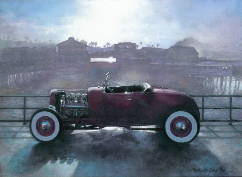
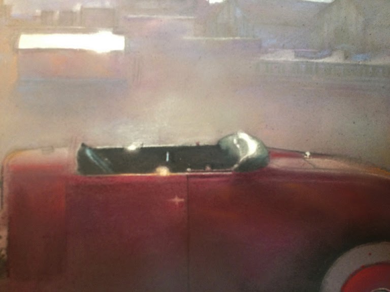
I admired an awesome iPhone photo taken by Jerry Mull of
his traditional fifties era 1929 Ford Hot Rod, when it was in the early morning
fog at the annual Redondo Beach Pier Car Show. I knew it would make a great
painting full of detail and drama.

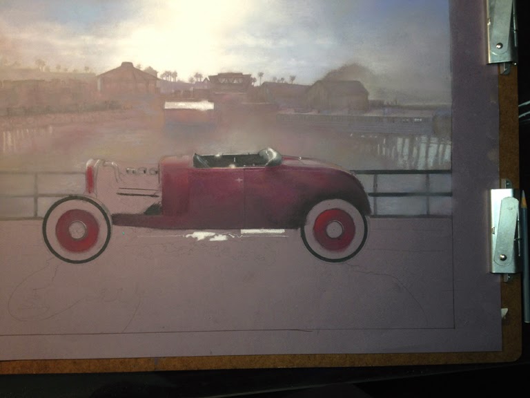
I like to start
my work by first studying my subject in person. I went to see this fabulous car
which was featured in the independent movie called Deuce of Spades. It got
its nickname “Challenger” because it was driven in the film by a young Hot
Rodder who challenged the film’s hero to a big race.
Notes were
taken on the car’s details that were obscured by shadows in the photo. I also went to the Redondo Beach Pier to take
more photos. The left side background in the photo was full of large buildings
that took the attention away from this car and I wanted a strong hourglass
composition. I took some photos of alternate backgrounds and more close-ups of
the Pier.
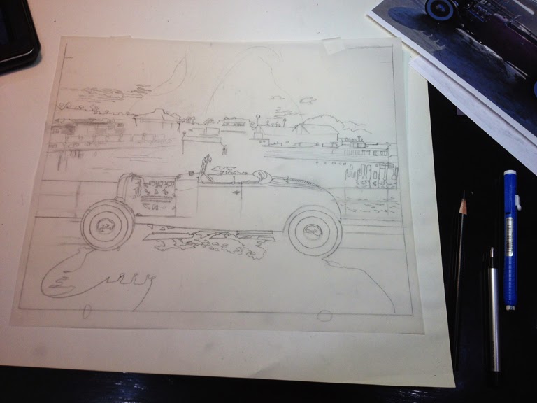
I like to start all my painting
projects with a detailed drawing on Canson Tracing Paper. It is more transparent than most brands and I
usually do multiple corrections on many layers.
I use General’s Layout Pencil as it is very black but it removes easily with
Staedtler plastic and stick erasers. To get the drawing correct technically,
straight edges, Alvin French curves, a divider, a Truflex flexable curve, a set
of Alvin ellipses, and a triangle were used.

After my preliminary drawing was
finished, I found out the measurements of the space where the framed painting
was going to be and then went to Fed-Ex to have it blown up to that size. I then traced it down with a Saral transfer
paper on to Canson Mi-Tiennes drawing paper in “Twilight”. This color was
perfect to show the background mist and influence the rest of the
painting. The background was to be kept
soft and purple to recede.
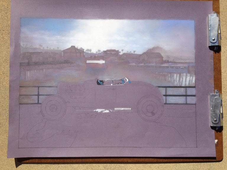
Before starting the pastel work I
put a small amount of “Gloves in a Bottle” on my hands. This protects them from
the harmful ingredients in some pastels such as the Cadmiums and Cobalt. As an
added safety precaution be careful not to blow on or inhale the loose pastel
dust. It’s best to dispose of it outside in a wind-free open area, by holding
the painting along one edge and carefully shaking it, avoiding contact with pets,
you or your clothing.
I did four layers of Unisom and
Terry Ludwig soft pastels on the sky and between the first three coats sprayed
Krylon Workable Fixative, leaving the top layer without protection. This was done to soak the white pastel into
the dark paper, darken the color for more value range and to create a rich and
smooth sky. I found it was also useful
to make a sign DO NOT TOUCH
ARTWORK! PASTEL WILL SMEAR!
I finished the top area first so
my hand was able to rest on the clean paper in order to get the details present
on the 1929 Ford. Pastel is messy and I find isolating areas keeps them
clean. I use a slippery plastic see-thru
notebook divider to rest on top of pastel I have worked, as it picks up less of
the pastel.

It is very easy to accidently cover
your detailed drawing information with opaque pastel. I am very careful not to lose this. I also put in the darkest darks and the
lightest lights and make sure as much as humanly possible that they are kept
clean. Rembrandt’s black and Schmincke’s
white pastel was used for their strong, rich color.

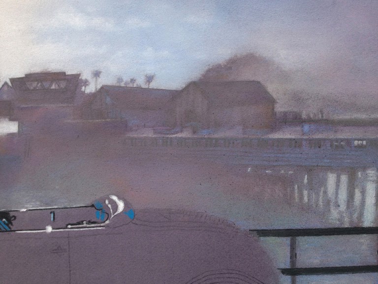
In certain key areas of the car I
used a very sharp Koh-I-Noor Gioconda, Stabilo CarbOthello or Faber-Castell Pitt
Pastel Pencil for extreme details. These
pencils do not work if you have too many layers of soft pastel. In some cases the lines were still not crisp
enough, so I used a black, blue and purple Pigma Micron 05 ink pen to define
small areas. If used in longer lines, it
will look cartoonish. I usually brighten
highlight areas with a white Sigma Uniball, then put white pastel on top to
unify the look. A great help was my lighted magnifying lens, reading glasses
and a steady hand. Needless to say, I
kept away from caffeinated coffee!


There is always an area that gives
you trouble in a painting. My greatest stressors
this time were the tires. They are not actually
round, but multiple, odd eclipses. This
took days to get it right. But then the
Pier to the right looked great after just ten minutes of drawing and the
concrete was easy as it was a beautiful abstract.
I used a dirty kneaded eraser as a
detail blending tool. One side’s point
is black, the other side is white. It
worked better than a Tortillon which just seemed to scratch off the pastel. I like Sofft Tool’s pointed knife No.4 and my
miniature Pastel Shapers which you can get from dakotapastels.com. The side of my little pinkie also did the
trick.

Erasing details was no problem
with Faber-Castell Perfection 1056 and Tomboy Mono Zero, from dickblick.com. Erasing the darkest spots left a stain on the
paper but it was easily covered by a layer of pastel.
When the 1929 Ford Hot Rod
painting was finished, it was bitter sweet to see it go. It looks great in its new cherry wood frame
with museum glass on the blue painted wall in its new home. Thankfully I do
have Giclee prints and cards to remind me of this both challenging and
satisfying experience.
Please see my latest Artwork on
Facebook: “Morgan Kari Artist”